Thursday, December 1, 2011

Visual Techniques

Unity, Fragmentation, Simplicity, Economy


Flatness, Sharpness, Activeness,

This motorcycle by Fuseproject called Mission Motors, is designed to be an efficent electric model while also being very visually attractive ,while the watch is an example of the sort of intuitive design for function. The motorcycle uses linear forms in the design of its body, contrasting the circular forms of the wheels. It uses sleek, linear lines to create a sensation of linear, forward movement. It's not necessarily utilitarian, but it's flat, simple body does little but cover up the battery and electrical motor.The watch, on the other hand, uses a simplicity that is in demand in the electronics industry. Most evident is the simplicity in its design, but also the contrast between the reflective center and the vibrant blue LEDs. This configuration promotes visibility above anything else, and defines its utility.

Contrast in Logo Design


Contrast is a key in creating dynamic, interesting, and memorable representations that people will associate with your company or product. In this case, the Windows logo by Microsoft is a simple design that proves to be successful. At the most basic level, the color contrast is immediately noticeable. The contrast between warm and cool adjacent colors in the "window panes" creates a dynamic center, which is juxtaposed to the unobtrusive background. The contrast between the window shape and the exterior circle presents itself. Interestingly, Microsoft chose not to use simply a square window within a circle, but a curvy window, which lessens the contrast, making it more comfortable on the eyes.


This other familiar logo, while basically a solid design, seems uninteresting or lacking when by itself. This is mostly due to an almost complete lack of contrast within the logo. We see a tonal gradient, but no change in hue. The shape is somewhat interesting, and the detached ellipse which forms the stem is a creative way to balance out the body of the apple. The tilt also helps to balance out the bite on the right side of the body. This logo is somewhat out of context by itself; on a black background or as a small etching on an electronic device it would look great, but by itself it lacks relevance.


Thursday, November 17, 2011

Navigation (Or My Annoying Process of Printing With Color Ink)

Maybe I'm just spoiled growing up in the 90's, but I expect all menus nowadays to be as close to intuitive as possible. I understand when working across hardware, certain limitations must apply, but the process of asking my printer to print black using only color ink (because I have color left, but no black) nearly enacted the some printer smashing rage in my room.

Naturally, my first thought would be to go straight to the Options button, but that yielded only this result:

It would allow me to print on the BACK OF THE SHEET, but no color options whatsoever. So I do the next best thing, and go back to "Properties" on the previous page. Note that by changing the ink usage, I am certainly not changing the "Properties" of the printer.


 Here we see the properties page. I had to look through every single tab, first going to "Main" and "Effects", before finally going to "Maintenance." At last, here, I find something similar to what I want:

You would think by this point I would be done, but no, that would be too easy. Upon printing, it told me I was out of black ink (duhh), upon which it gave me two clickable buttons, one titled "Shop for Ink" and the other "Cancel Printing". At this point I nearly gave up. Only after many tries did I finally decide it would be best to click the little tiny (X) to close the window. For some reason this worked, and my printer printed as I would like it to. I have not been able to replicate this last part since I first switched it, so I guess it caught on. Still, this has been one of my worst memories navigating virtual space through menus.

Thursday, November 10, 2011

Dimension/Depth/Space/Scale

"3D" displays are infiltrating our GUI's and our consciousness more and more today, sometimes for the better, and sometimes as an unnecessary addition. However, the use of 3D to help us put substance to otherwise abstract and uninteresting menu trees can be refreshing, but map making, wayfinding, and displaying 3D objects are enhanced even more by 3D. For example, while using a map in the city, the size of a city block can vary greatly, but by displaying the actual buildings such as in Google Maps, we can very quickly understand the scale through the relative and familiar size of the buildings. In other forms of wayfinding, like signage and fixed maps, size dominates the the practical expression of dimension. However, depicting 3D objects on 2D media requires different techniques. Just as in painting, using 3-point rendering techniques and accurately displaying texture gradients help us make the mental leap between a flat 2D display and a 3D object. Similarly, when it come to navigating complex decisions in digital environments, 3D can help us better organize and present the information. This is usually best accomplished through again, relative size of elements, and their organization along linear perspectives.

Thursday, November 3, 2011

Tone and Color in Film Industry Advertising

The film industry is reliant on catering to the diverse interests of the American public, from lighthearted children's films, romantic films, comedies, horror flicks, action movies, and documentaries, just to name a few. When advertising for films like Tron 2 pictured here, tone and color are key in characterizing and balancing the image.

Here, the two elements are used to build contrast, balance the image, and define characters pictured. Tone is used to highlight the two figures in the center, and contrast them to the dark, threatening world they find themselves in. This has an interesting effect on dimension, but also helps to develop the direction and linear structure created by the beam of light. In a break from the norm, the characters in the foreground are pictured in a darker tone, altering the conventional way tone defines dimension, creating an almost dimension-less feel.

Color is used in this image is used primarily to create a warm/cool contrast in the image, and to pique more interest in the many bright lines which define the world. The color usage in this image is very typical of Hollywood, using a warm red/orange color opposed to a cool blue/green in order to draw the viewers attention and highlight scenes or actors they want you to remember. In this case, the warm and cool lines on the characters and structures foreshadow conflict along these lines in the movie.

Thursday, October 27, 2011

The Basic Elements: Electronics Design

The Basic Elements: Electronics Design

Both in diagram and products, electronics design primarily incorporates lines, shapes, and direction. These forms are best suited to describing electronics, as they are concerned with current and the different functions which control it. It is just as important which parts are involved in a circuit as about how they are connected.

The line, for example, is key in showing connectivity. Showing what is connected is similarly as important as how they are connected. These connections are best illustrated through the use of lines and shapes to connect the various pieces together. In this way, complicated electrical circuits can be rendered (relatively) simply. A resistor, for example, is represented by a zig-zaged line, which also represents its function as compressed resistance. Capacitors are represented similar to their construction, with two parallel lines that do not touch. These visually represent the two plates which hold the charge in a capacitor.
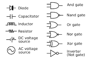
Shapes serve to represent different parts in an electronic circuit. They have to be clear and concise in order to get their message across. For example, all diodes, including LED's, are represented by triangles pointing to a perpendicular line. Unlike the capacitor or resistor, the diode symbol is not directly related to their construction or even their function, but serves as a consistent, eye-catching representation, onto which modifications can be attached to indicate special functions.


To understand any electrical circuit, the order that the elements are connected in is key. Unlike most applications of direction, it does not matter so much if an element is facing right, left, up, or down, but where it is in relation to others. Some elements, especially logic gates and IC diagrams, where connections occur on an otherwise unlabeled element are very important. For example, the direction logic gates are facing determine which side is the input and output, the input being at the larger end, and output at the smaller.

Thursday, October 20, 2011

Visual Thinking Research

Block Twins
This block puzzle was slightly ambiguous, and my roommate and I both had different ideas about how it was supposed to work. I thought it was asking which shapes were composed of two equal pairs, and so I circled the 6 which I thought could be split into two equal parts. I started with the ones with no extra blocks in between, but after about 3 circles, I realized the others with equal halves all had one extra block in the center. So then I circled those too. I checked to see if the halves were mirrored, and if so, I did not circle them.
Here's my roommates sheet. As you can see, he paired up the different shapes, but he did so by looking to see if the elements (halves) were similar, instead of the shape as a whole. He didn't try to mentally rotate the shape and compare them, as we learned the test required. In this way, both of us kind of failed miserably. The instructions were not clear, and the last part saying that "a shape from one pair doesn't appear in another" did not help at all.

Areas in the Big Square
This one was a lot more straightforward, and in the end, we both got the right answer. Above, you see my roomates work, where he separated the overlapping edges, and counted how many edges of the squares inside were visible. This method worked well for him, and he actually came up with the answer, that the blue and green circles have the same area, before me.
Here you can see mine, where I counted each section which was overlapped. I assigned sections overlapped by another color more "value" than ones overlapped by the same color, but counted both. Mine was not as visually apparent, because I had to think about it in numbers as opposed to shapes, but I came to the same conclusion. The irregular configuration also made it difficult to apply this strategy, as I found myself mixing up which number went with which color.

Thursday, October 13, 2011

Visual Perception 2/Feature Hierarchy


The GE Wattstation by fuseproject is an attempt to make electric cars more publicly accessible to new owners. Doubling as a parking meter, this charger is planned to be brightly colored to differentiate it from normal ones, drawing attention to it. The design is trimmed down the charger to its bare functions: the plug itself and the coiled cord which is instantly visible. Upon looking at the device, we are greeted by a friendly interface with "Hello". This is indicated to be a touch screen button by its bright outline. Instead of having many features which draw your attention away from the primary function, this charger makes the process as simple as possible by presenting the users with very few visual elements, besides the necessary intuitive ones. This is a departure from previous chargers, which could provide the user with too much information, or too many charging options. By restricting it to its basic functions, it focuses the user on the essentials, which are all lined up on top of one another to be located intuitively.

The Wattstation will be planted in a few test locations around San Francisco next year.

By Yves Behar and fuseproject Design.

Thursday, October 6, 2011

Top-Down Visual Processing

I thought this bus advertisement for the Copenhagen Zoo was particularly "gripping". The snake itself startling, but what really makes this paint job excellent is how the bus actually appears to be crushed. Though the edges around the snake are black, and the colors around the "crushed" areas are distorted, the effect is quite convincing. This comes from our Top-down visual processing of the image. We expect a black area in this case to be a shadow (from an absence of material), and shades of color indicate to us the material has depth, and is deformed. This effect is especially strong when we only see it in a two-dimensional image.

From Bates Y&R, Copenhagen

Friday, September 30, 2011

Design Sucess and Failure in Relation to Syntactical Guidlines

Many different Olympic logos have been created for 2016, some better than others. The Tokyo one struck me as the best designed. Your eyes follow the "tie" in the Olympic band down to the rising sun in the logo, providing instant understanding of the logo. The tied band is balanced with the rest of the logo, but not in a simple way, the angle creates interesting stress.

On the other hand, this logo is almost all stress. Not only that, but without the text, I would have no idea what the logo was for. The stress lines aren't parallel, so they're not really boring, but they seem to serve no purpose. The square in the center also serves no purpose other than to prevent a negative space in the center from developing. The grouping of the four numbers into a square, necessitating the square, also seems unnatural and forced.

Thursday, September 8, 2011

Meaning 1: Representation, Abstraction, and Symbol

Representation:

This photo does a very good job of putting you in the location, and because of that I think its an amazing representation. The framing of the photo helps include the explosion of colors from the sunset and the environment, without losing the ambient light which makes the scenery so beautiful. Although there is limited visibility laterally, the photo captures everything from the path under the bridge to the clouds in the sky above. You can also see the city settled into the hills off to the right, adding a sense of depth. The slight lens flare also realistically conveys the brightness of a sunset.


Abstraction:


This piece of art by Tiago Hoisel seems to be the perfect abstraction of the ignorant tourist. It seems to be both a symbolic abstraction and a stereotypical visual abstraction. We see the clueless tourist so eager to capture himself in his destination that he is completely ignorant to the tidal wave, erupting volcano, and molten rock crashing right next to him. His cross-eyed face with its dumb grin, his belly, and socks with sandals are all abstractions of the stereotypical tourist. The other aspects, like the disasters he is ignorant to, are a symbolic abstraction of the ignorance ascribed to tourists.

Symbol:

This punk rock logo is so appropriate you may even be able to guess the name of the band from it. Bad Religion, anyone? As with most logos, its genius lies in its simplicity. It's two main elements, the cross, which is associated worldwide with Christianity (or to a Christian culture, simply religion), and the red circle with a diagonal line through it which is nearly as universally recognized as "No", or "Do Not". This symbol tells us a lot about the message, values, and ideology of Bad Religion and the punk rock movement: We do not want your religion.